Color is the single most transformative element in interior architecture. In a bedroom, where the primary objective is emotional restoration and physical rest, selecting an aesthetic color theme goes far beyond decorative preference. Color directly governs spatial perception, influences light reflectivity, and triggers autonomic nervous system responses—either stimulating wakefulness or signaling the body to wind down.
Designing a color scheme for a modern sleeping sanctuary requires a deliberate balance of hue, saturation, and chromatic value. It demands an understanding of how natural daylight changes across the day and how artificial lighting alters paint pigments at night. Whether you are painting a compact apartment room or curating a sprawling master suite, anchoring your space with a clear color story elevates standard walls into an immersive, harmonious retreat.
Here is an architectural guide to ten aesthetic bedroom color themes, complete with material combinations, lighting strategies, spatial applications, and precise color formulas.
Foundational Rules for Bedroom Color & Lighting Architecture
Before committing to a color theme, apply these core architectural principles to ensure visual cohesion and spatial balance:
- Follow the 60-30-10 Rule: Distribute your color palette proportionally across the space. Allocate $60\%$ of the room to a dominant base shade (walls, ceiling, large rugs), $30\%$ to a secondary shade (upholstery, drapery, bedding), and $10\%$ to an accent tone (art, metallic fixtures, throw pillows).
- Account for Window Orientation: North-facing rooms receive cool, bluish daylight; balance this with warmer undertones (cream, terracotta, warm taupe). South-facing rooms enjoy bright, warm light all day, allowing you to use cooler tones (sage, slate, deep navy) without the space feeling sterile.
- Calibrate Color Temperature & CRI: Pair your paint choices with warm, low-kelvin light sources ($2200\text{K}\text{ to }2700\text{K}$) featuring a high Color Rendering Index ($\text{CRI} \ge 90$). This ensures your chosen pigments look rich and authentic after dark rather than washed out or greyish.
- Envelop the Ceiling (Fifth Wall): For moody or high-contrast themes, paint the ceiling in either the same shade as the walls (for a cozy, cocooning effect) or a $25\%$ lighter tint of the wall color to lift the room visually.
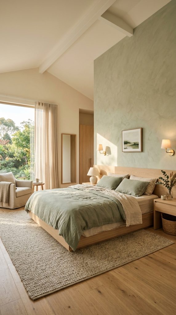
1. Sage Green & Warm Cream
Rooted in botanical tranquility, a sage green and warm cream color theme brings the calming qualities of nature indoors while maintaining a bright, airy architectural footprint.
Material Specs & Architectural Layout
- Dominant Shade (60%): Warm chalky cream or alabaster applied to main walls and window drapery.
- Secondary Shade (30%): Muted sage green utilized across an upholstered bedstead, linen duvet, or built-in cabinetry.
- Accent Shades (10%): Raw oak timber, brushed brass light stems, and muted terracotta ceramics.
- Lighting Interaction: Morning daylight enhances the cool freshness of the sage pigments, while warm evening lamps ($2700\text{K}$) draw out golden undertones in the cream walls.
Design Tip: Apply a soft lime-wash finish in sage green behind the bed frame to introduce subtle texture and organic movement without overwhelming the room.
2. Deep Eucalyptus & Matte Charcoal
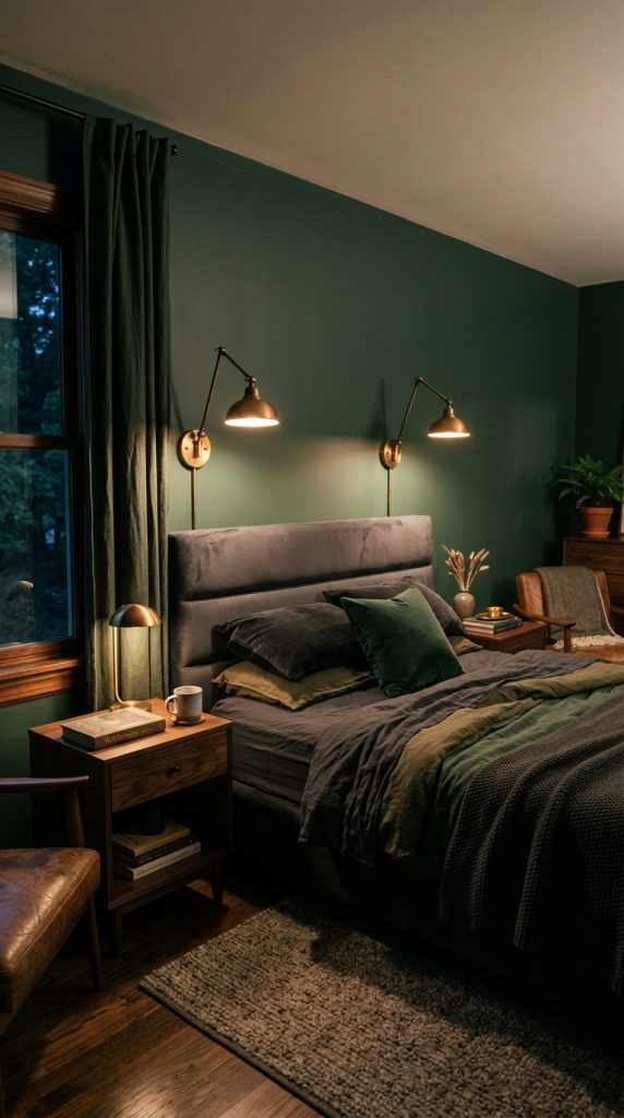
For an intimate, cocooning atmosphere that encourages deep slumber, deep eucalyptus and matte charcoal combine dark botanical depths with urban structural groundings.
Material Specs & Architectural Layout
- Dominant Shade (60%): Moody eucalyptus green on all four walls, matching baseboards, and ceiling crown molding.
- Secondary Shade (30%): Matte charcoal grey applied to headboards, textured rugs, and heavy velvet floor-length drapes.
- Accent Shades (10%): Antique brass, warm cognac leather, and crisp white porcelain lamp bases for subtle visual contrast.
- Spatial Application: Ideal for dedicated sleeping quarters where reducing light bounce is critical for sleep hygiene.
3. Terracotta, Warm Ochre & Bone White
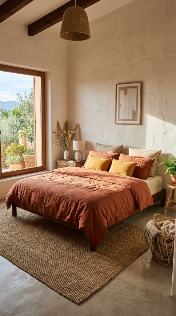
Capturing the sun-drenched, rustic warmth of Southern European architecture, terracotta and warm ochre produce an inviting, earth-bound sanctuary.
Material Specs & Architectural Layout
- Dominant Shade (60%): Bone white or off-white wall plaster that reflects ambient light softly.
- Secondary Shade (30%): Burnt terracotta introduced through woven area rugs, linen bedding, and accent lounge seating.
- Accent Shades (10%): Warm ochre yellow cushions, dark olive wood furniture, and wrought iron lighting frames.
- Textural Pairing: Pair these earthy pigments with micro-cement floors, jute rugs, and unrefined wooden side tables.
4. Slate Blue & Crisp Linen White
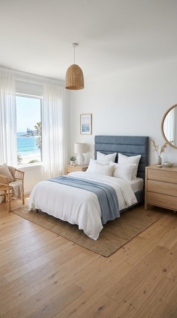
Evoking coastal horizon lines without relying on kitschy marine motifs, slate blue and crisp linen white offer a cool, restorative palette that lowers heart rates and settles visual energy.
Material Specs & Architectural Layout
- Dominant Shade (60%): Crisp linen white across walls, window sheer curtains, and ceiling planes to maximize light diffusion.
- Secondary Shade (30%): Dust-toned slate blue applied to accent feature walls, channel-tufted headboards, or built-in closets.
- Accent Shades (10%): Pale driftwood grey, brushed nickel, and woven seagrass decor.
- Orientation Suitability: Exceptional for south- or west-facing rooms that receive intense afternoon warmth, as cool blue tones balance incoming glare.
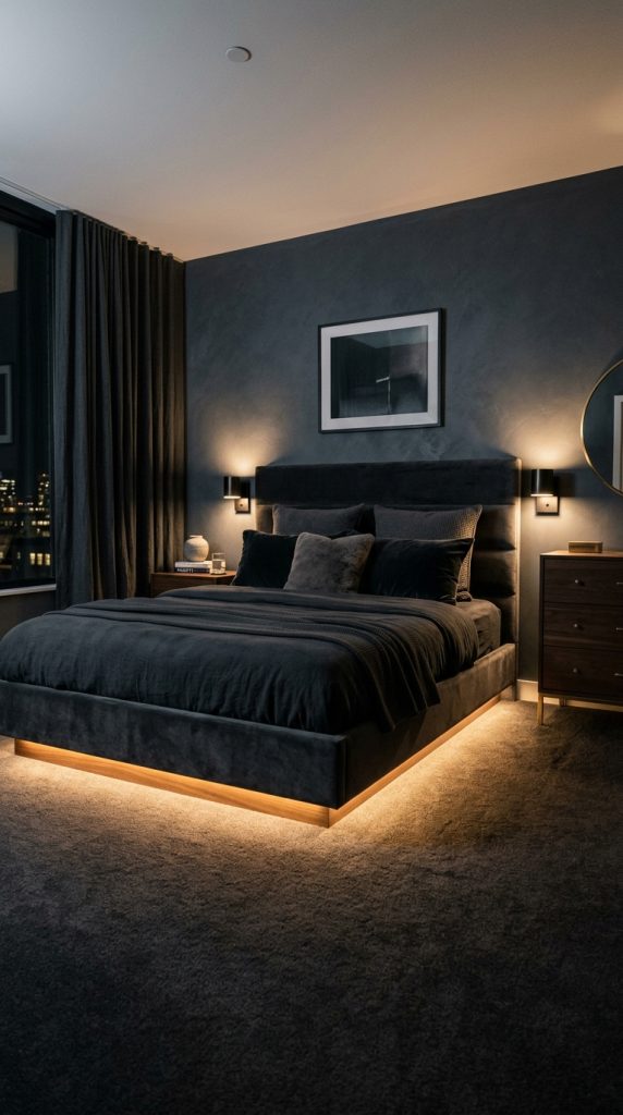
5. Monochrome Charcoal, Graphite & Jet Black
Embracing high-end hotel lounge luxury, a monochromatic dark charcoal palette uses subtle tonal shifts and rich texture variations to create an envelopment of quiet sophistication.
Material Specs & Architectural Layout
- Dominant Shade (60%): Slate charcoal paint across all wall planes and structural trim.
- Secondary Shade (30%): Graphite wool carpeting, charcoal velvet duvet covers, and dark smoke-tinted glass lighting globes.
- Accent Shades (10%): Matte black steel frames paired with razor-thin warm LED channel accents ($2200\text{K}$) to carve out architectural depth.
- Lighting Strategy: Rely heavily on indirect accent lighting—such as under-bed LED glows and wall-recessed cove lights—to prevent dark surfaces from absorbing all spatial dimensions.
6. Muted Mauve, Dusty Rose & Warm Greige
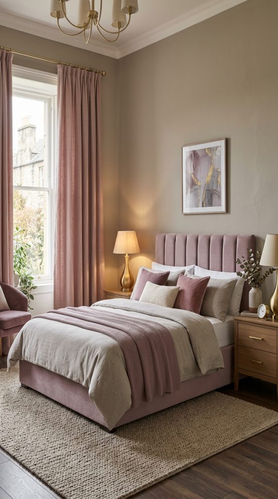
Offering a sophisticated departure from stark neutrals, muted mauve and dusty rose bring soft, romantic warmth without feeling overly sugary or bright.
Material Specs & Architectural Layout
- Dominant Shade (60%): Warm greige (grey-beige) wall paint that grounds the room in quiet neutrality.
- Secondary Shade (30%): Desaturated mauve or dusty rose applied to upholstered beds, drapery, and throw blankets.
- Accent Shades (10%): Polished copper, champagne gold fixtures, and alabaster stone nightstand tops.
- Atmospheric Quality: Soft, skin-flattering undertones that cast a warm, comforting glow when illuminated by bedside lamps.
7. Oat, Sand & Bleached White Oak
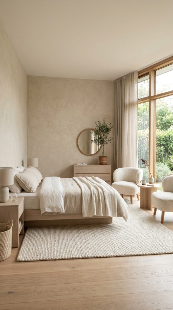
Representing the pinnacle of Scandinavian and Japanese minimalist fusion, oat, sand, and bleached white oak form an ultra-serene, low-contrast monochromatic neutral sanctuary.
Material Specs & Architectural Layout
- Dominant Shade (60%): Light oat or sand plaster walls paired with matching off-white wool loop rugs.
- Secondary Shade (30%): Natural light-bleached white oak used for platform bed frames, wall cladding, and side tables.
- Accent Shades (10%): Soft bone white linen bedding, travertine stone lamps, and unbleached cotton throws.
- Design Execution: Focus entirely on textural variation—combine bouclé fabric, raw linen, rough-sawn wood, and smooth stone to prevent a low-contrast room from feeling flat.
8. Midnight Navy, Walnut & Brushed Brass
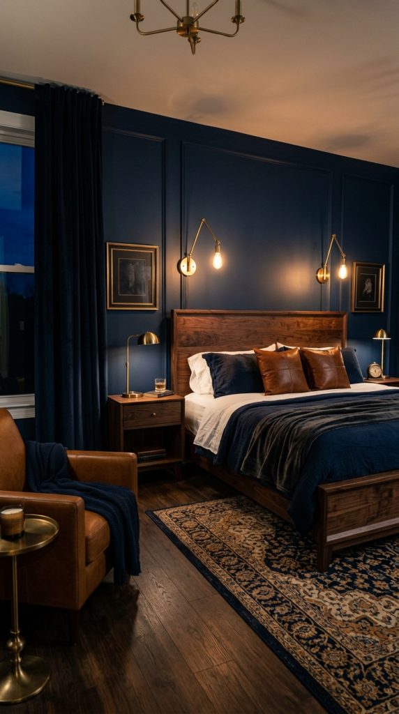
Dramatic, timeless, and stately, a midnight navy and dark walnut color story creates a nocturnal sanctuary designed for evening indulgence and deep rest.
Material Specs & Architectural Layout
- Dominant Shade (60%): Rich midnight navy paint in a matte or eggshell finish on feature walls or full room wraps.
- Secondary Shade (30%): Dark American walnut timber applied to bedframes, credenzas, and hardwood flooring.
- Accent Shades (10%): Brushed brass sconces, gold-framed art pieces, and warm cognac leather accents.
- Acoustic Harmony: Deep blue walls paired with heavy walnut furniture create a heavy, quiet spatial feel that aids sound damping.
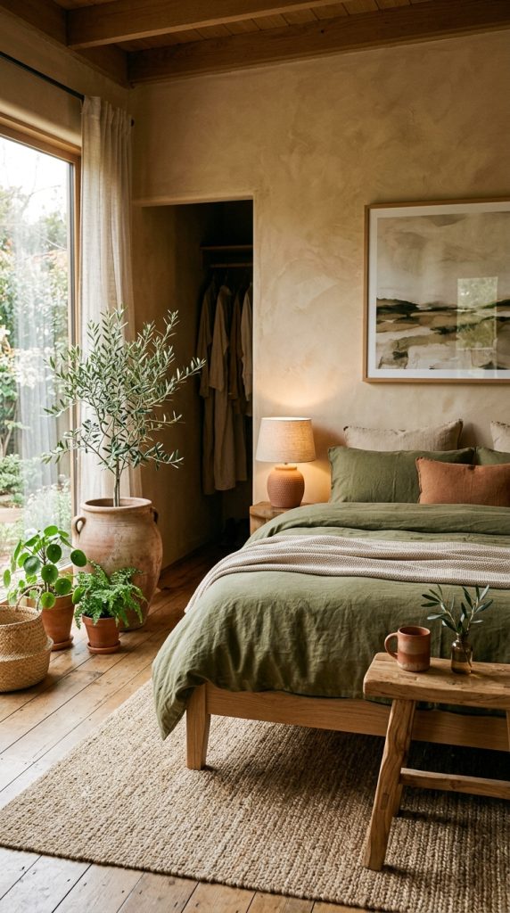
9. Warm Clay, Terracotta & Soft Olive
An organic, Mediterranean-inspired trio, warm clay and soft olive fuse grounding earth hues with subtle leaf accents for an artistic, retreat-like ambiance.
Material Specs & Architectural Layout
- Dominant Shade (60%): Warm Roman clay plaster in a soft beige-clay hue applied across walls to yield subtle texture.
- Secondary Shade (30%): Muted olive green linen bedding, velvet armchairs, or area rug patterns.
- Accent Shades (10%): Terracotta pottery, raw travertine coasters, and matte black iron accent hardware.
- Visual Appeal: Radiates rich, warm organic energy throughout the day, catching golden hour light exceptionally well.
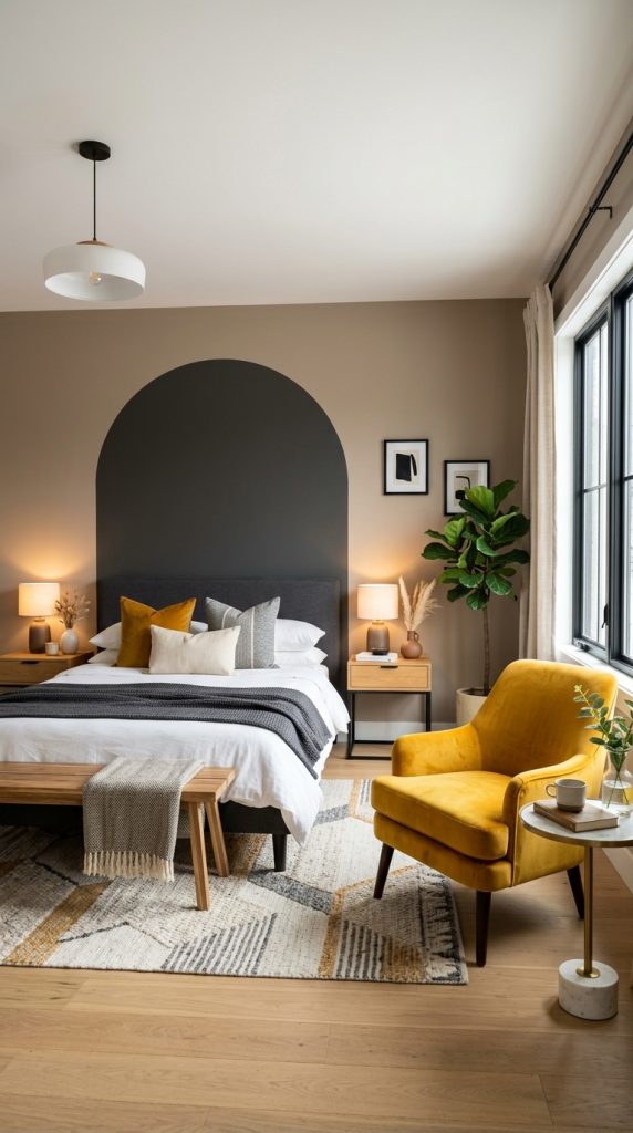
10. Charcoal, Warm Taupe & Ochre Yellow
For a contemporary, art-forward space, charcoal, warm taupe, and ochre yellow pair structured neutral foundations with striking, energetic color blocking.
Material Specs & Architectural Layout
- Dominant Shade (60%): Warm taupe wall paint providing a calm, balanced canvas.
- Secondary Shade (30%): Deep charcoal grey used on cabinetry, dark window trims, and heavy rugs.
- Accent Shades (10%): Ochre or mustard yellow targeted on sculptural velvet accent armchairs, throw blankets, or abstract art pieces.
- Color Blocking Strategy: Paint a focal arch or rectangular block in warm taupe or charcoal behind the headboard to frame the sleeping zone precisely.